3 type of design email marketing
Email design is one of my favorite topics because it is helping to convert customers into buyers, even if your strategy is great and your copy is very good, if the design is bad and does not present the information correctly to the reader, making it attractive, and easy to digest, then your email will not perform well.
I have seen some interesting trends in email design that I want to share in this article. I have personally seen various types of emails, and I have a secret mailbox where I subscribe to everything, literally everything I can think of, especially when it comes to direct to consumer brands and e-commerce brands and I have seen some interesting things in my mailbox lately that I want to share with you.
Typography-based design with moving images (gif)
I wonder if you use gifs in your emails? Gifs have become very popular in email design. I use them a lot in Lock and Go because we see that they really help increase click rates and conversion rates as well as sometimes also sales rates this is good for interaction, so we use them a lot. One interesting specific use for gifs is to use them when playing with types and fonts, and drawing attention to important parts of the email and using gifs for that purpose.
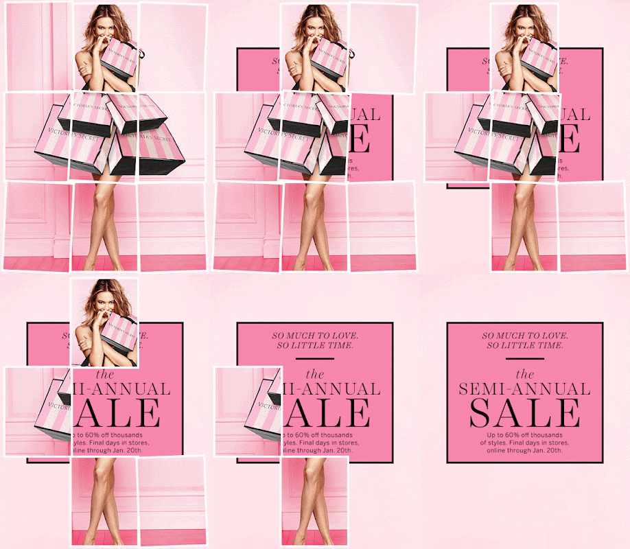
This is an example, see how they just use a simple gif where the gift fills the left right empty part to draw attention. Very simple and yet fulfills its purpose of drawing my attention.
Here is another example, another slightly different example, and finally this one which is quite striking Victorias secret, they use a typography-based gif with a little difference. As you can see this draws attention to the middle part of the email that might not get as much attention as this. Honestly I think there is too much going on here but it also works. What do you think about this?
Create and use very narrow email for desktop
If you are in email marketing, you know that more than 50 percent of your subscribers actually open their emails on their phones, which means only 3 out of 10 people will see the email you send on their desktops, and yet most brands still design their emails first for desktop, and then optimize them for mobile. Based on these numbers, it should be the other way around.
An interesting trend that I noticed in my inbox is that some brands choose to create mobile first emails, but then send them to everyone and don’t even make a desktop version at all because the mobile version works well on desktop.
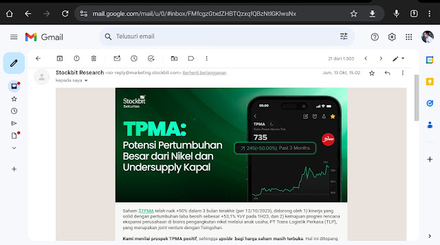
One of the brands that does that consistently is stock bibit. They are a platform that provides investment products. As you can see this is a very narrow email, when I look at it on my desktop there is a lot of space on the right and left, but all the text is very easy to read, big enough, the buttons are very appropriate and correct, and everything looks great.
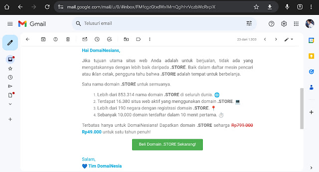
Here is another email from Domainnesia. Again, as you can see, everything is very easy to read, attractive, looks great, the information is presented in a way that is easy for me to read, very narrow and yet works on desktop. The cool thing is they don’t have to optimize it for mobile at all, they just send the same version for desktop and mobile, and everything works well.
In my opinion this is very efficient for the email production process, I just want to give you an example to compare it with something more standard for desktop design. But of course it comes back to what you think, will you start designing your emails in a different way after this? Do you think it’s worth switching to mobile-first design and only then optimizing it for desktop?
Creating email with only images
One of the latest email design trends that I want to talk about today is creating email with only images, which we call “all image emails”. All image emails are when you design your email outside of your email platform, for example in figma or canva, and then you export your design as a Jpeg file, and you just upload it to your email platform.
A few years ago, this was rare, most senders would design their email directly in their email platform like Mailchimp or klaviyo, and then send it but now more and more brands are using only images and sending email that way.
When you do this, there are a lot of things that you need to consider for delivery success because the text to image ratio is one of the most important things for your delivery success that means if you have too many images and too little text, your email will tend to go to the spam folder and definitely go to the promotions tab much more often than to the main tab.
There are ways to overcome this, like alternative text. If you upload your whole design as an image, you should always add alternative text behind the scenes to make sure that ratio is still maintained but the reason brands don’t do this is because most people
As I just mentioned, open their emails on their phones, and what’s interesting about all the accounts that we manage is that the best time for open rates tend to be in the afternoon, which means most of your recipients are seeing your emails while using dark mode on their phones because for most users.
Dark mode turns on automatically in the afternoon, and then some people prefer dark mode and use it all the time, even though I don’t get it, I don't like it but most people tend to like it and that’s why I use dark templates on this blog.
All Image design is a design that uses images for all the elements of the email, including the text. There is no good solution to make email look good in dark mode without an All Image design, and that’s the reason why I think a lot of brands are switching to this design. I will show you some examples of email with All Image design in my inbox.
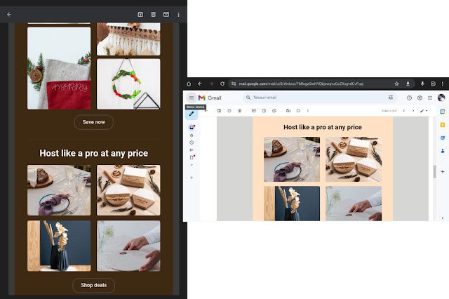
This email uses an All Image design, and it looks great here, both on desktop and on mobile. Here you can see that this email looks very good in dark mode. All the colors and branding same, the text is easy to read and accessible, and the images are clear. This is a very attractive and professional email.
So I hope this gives you an idea of why All Image design is so important right now, especially with a lot of people opening their emails on their phones in dark mode. All Image design makes your email look more professional and increases your customer engagement and loyalty.
That’s also another important thing when it comes to email design, If you make it even slightly hard for people to understand your email and understand what you want to say to them, they just won’t do it.
Good email design must also pay attention to the ease of readers understanding the content and message of your email, if your emails are too complicated, messy, or unclear, your readers will lose interest or even get annoyed,
so don't make your readers work hard to figure out what you want from them, make your emails simple, attractive, smooth, and efficient and that's the key to your email success.


Gabung dalam percakapan